About arteba
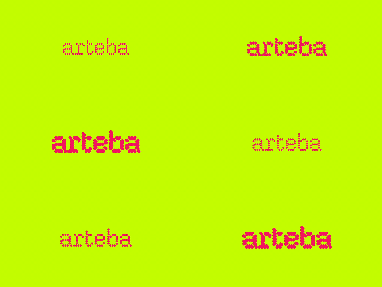
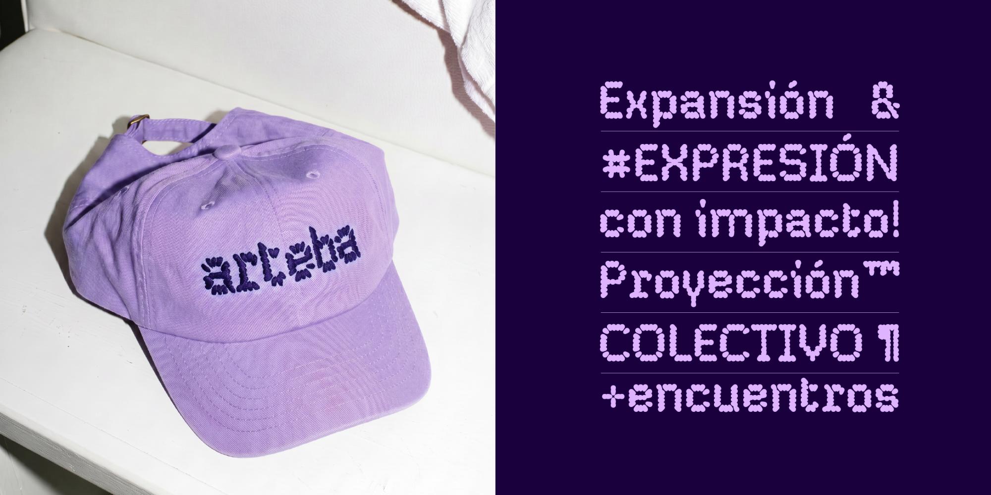
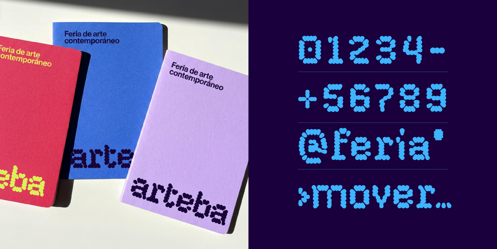
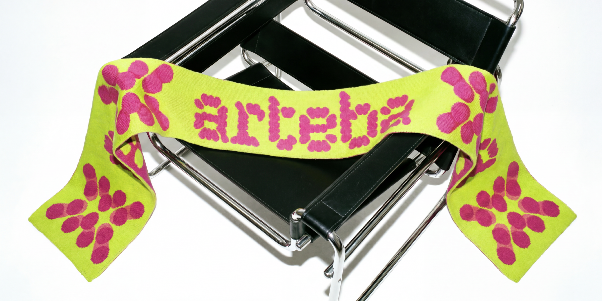
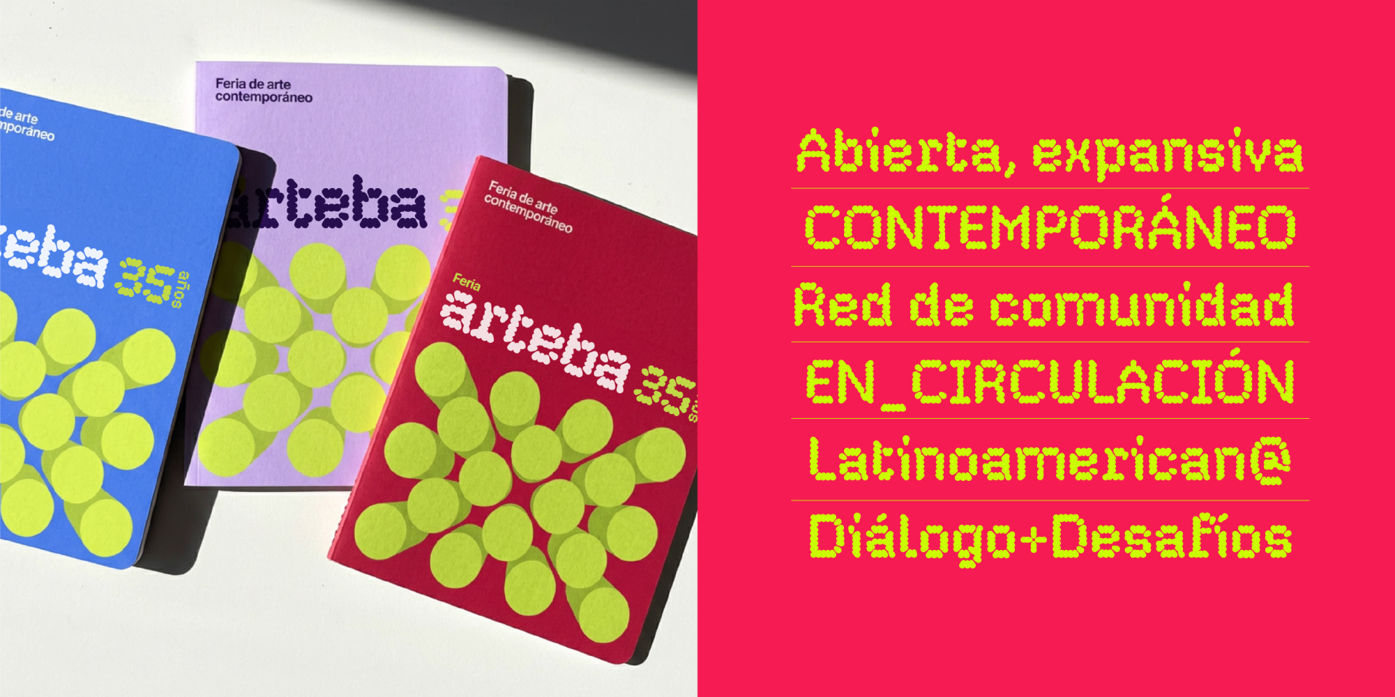
For its 35th anniversary, Fundación arteba (which promotes the production and dissemination of visual arts in Argentina) renewed its visual identity. The new concept was developed by Buenos Aires agencies GUT and Urban, who brought me in to design the typeface.
A scene in expansion needs an identity that moves the same way: open, networked, never finished.
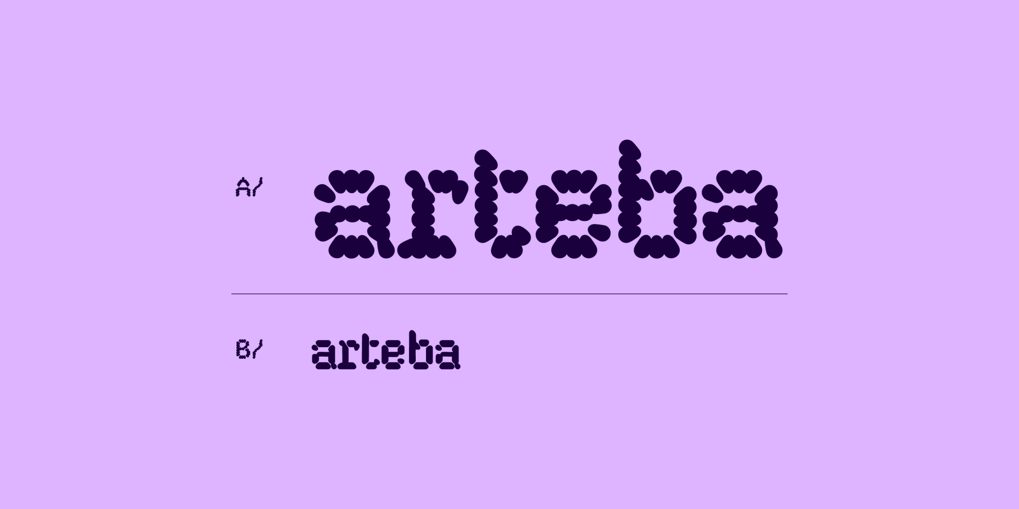
We started from the smallest possible unit (a single point) and asked how far it could grow. Repeated, it builds structure. Structure builds connection. Connection builds community. And community is what keeps contemporary Latin American art circulating, meeting, crossing borders, expanding.
Every letter in arteba's new typeface follows that same logic. Points expand and multiply until they become characters, organic and systematic at once. Nothing arbitrary, every curve carrying the same principle that shapes the identity as a whole.
Expansion isn't just a form here. It's what art does best: it connects people who wouldn't otherwise meet, and it grows through that meeting. One point becomes a letter. One letter becomes a system. One encounter becomes a scene.
- Art Direction
- Gut Design
- Client
- arteBA
- Year
- 2026