About pulso
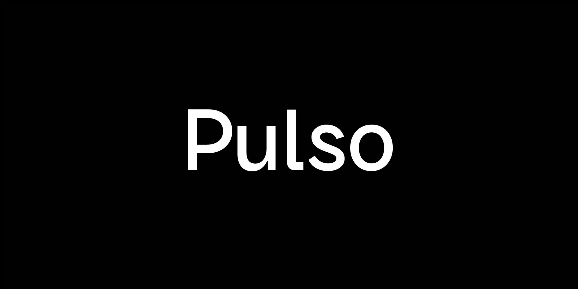
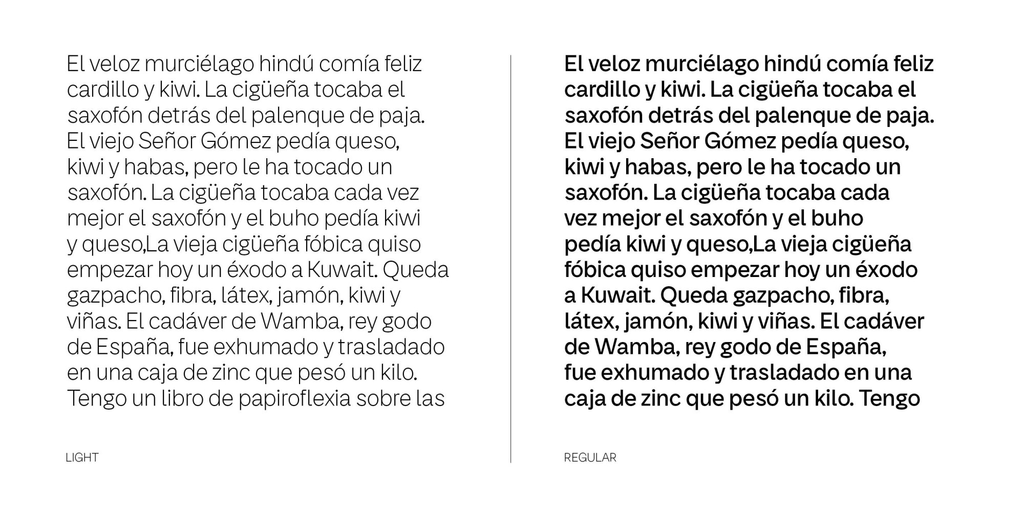
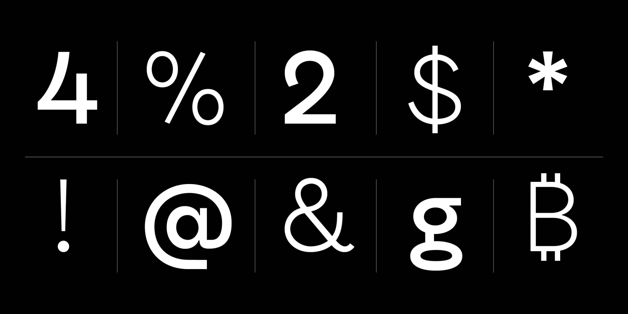
Pulso is a custom typeface that accompanies the global and diverse brand of Telecom, Personal and Flow.
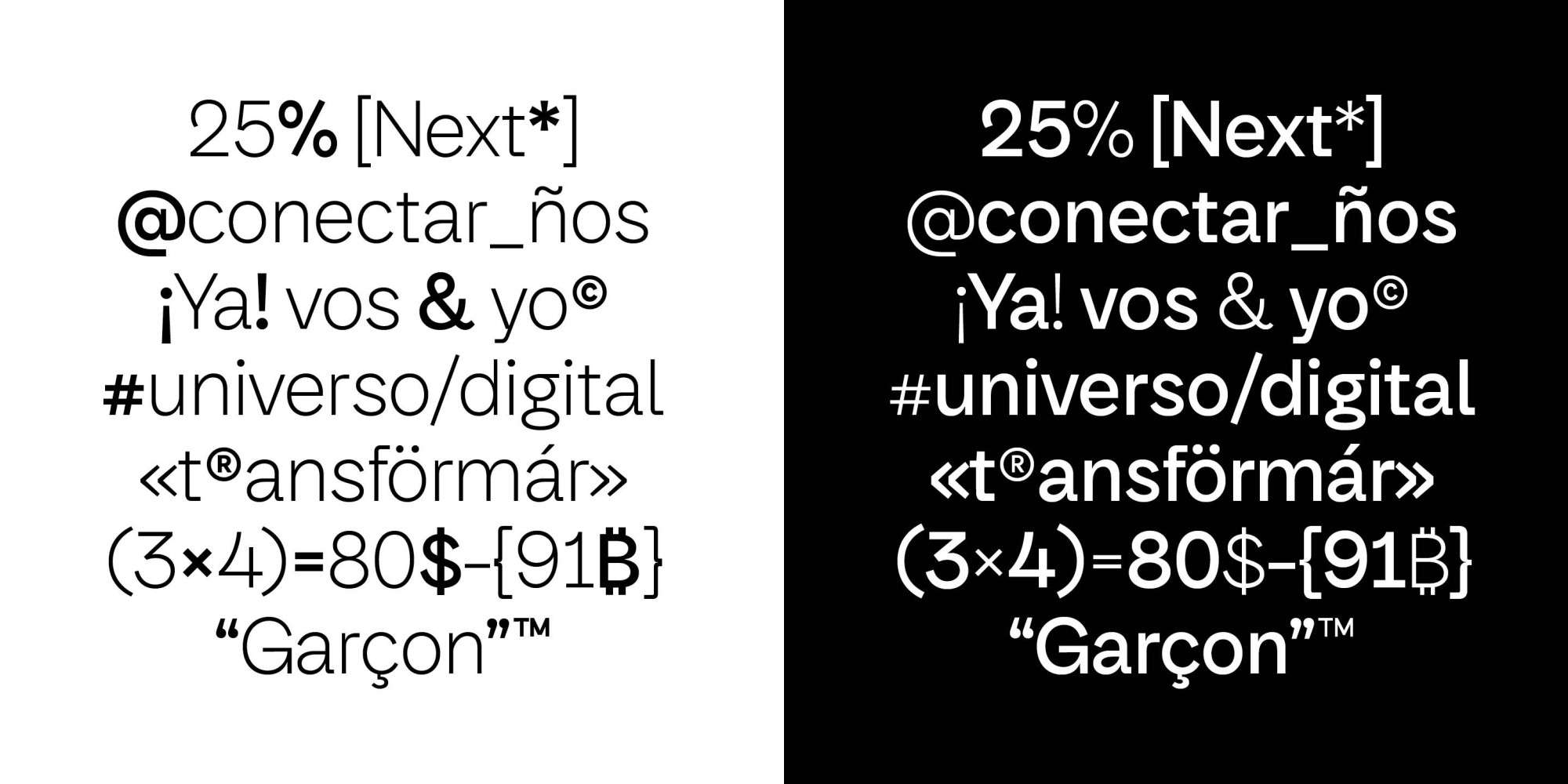
It is functional and distinctive, according to the tone of the logo, words and communication. Each decision has a purpose and each detail a reason for being.
Pulso is not just another grotesque. Pulso arises from the union and combination between technological vision and human quality. Between the natural and the artificial. Between the rational and the organic. Between the classic and the avant-garde. Supported by history but looking to the future, Pulso is simultaneously contemporary and historical, rigorous and gestural, objective and subjective, refined and forceful.
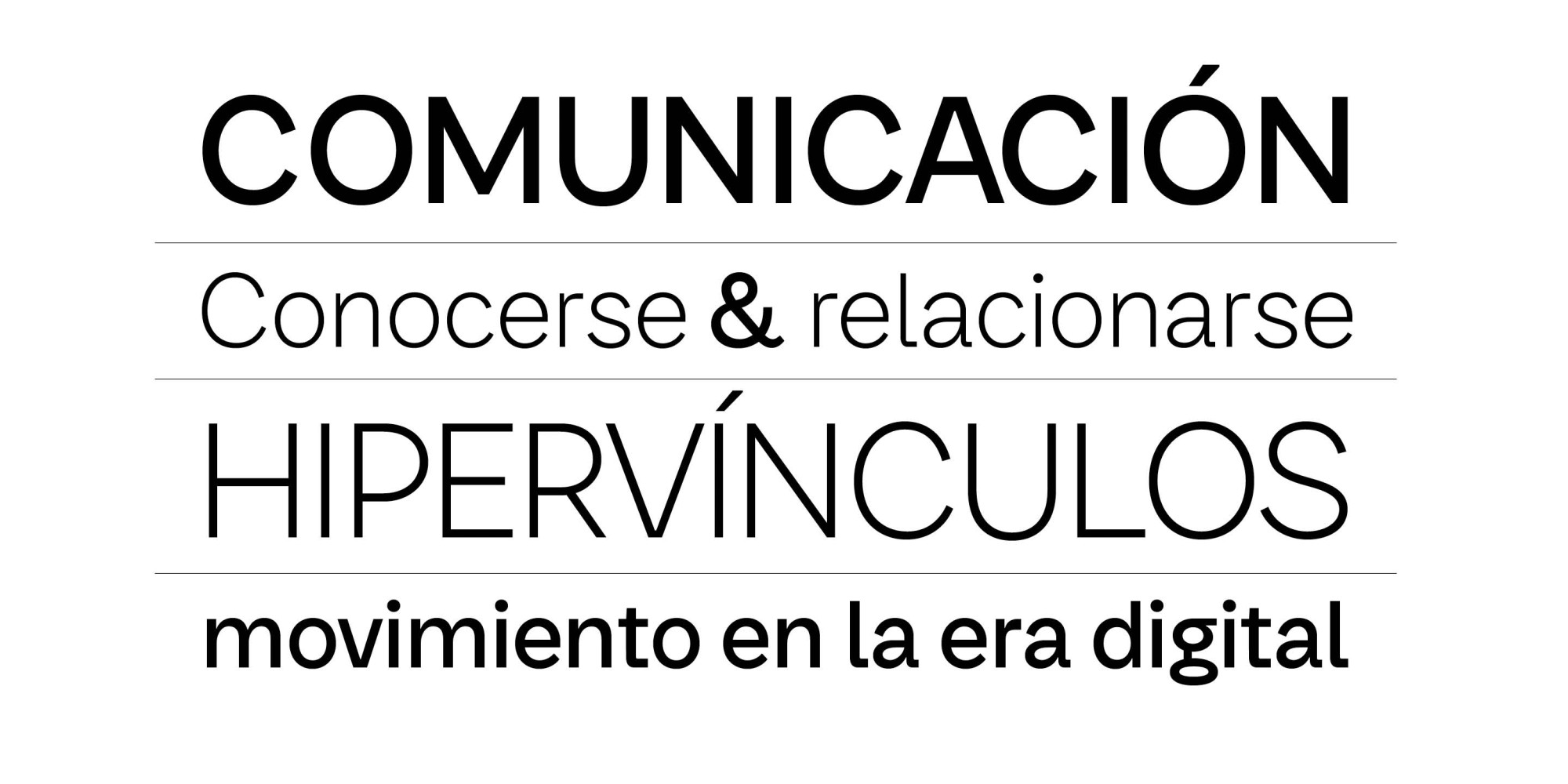
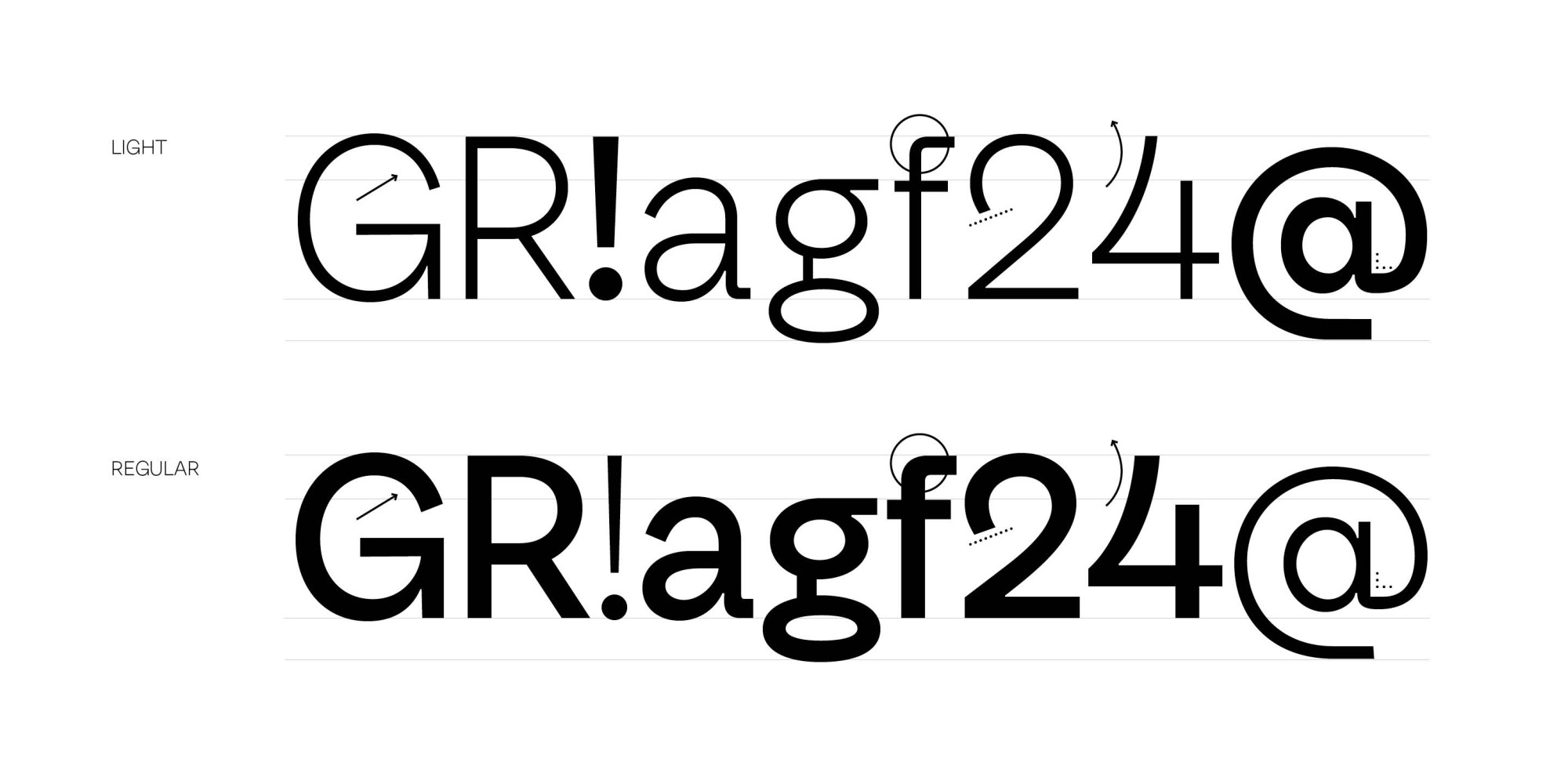
Pulso has two weights –light and regular– forming words in a sincere and direct way, but also a bit mischievous at times. It can be pleasantly forceful in certain settings, but it also contains necessary moments of sensitivity and finesse in your drawing. In its application, Pulso manages to refer to the past, capture a particular version of the present and postulate a vision for the future.
- Art Direction
- Alegría & Javier Reboursin
- Project management
- NoMad
- Client
- Telecom S.A.
- Team
- Fer Cozzi & Isaías Loaiza
- Year
- 2020
- Recognition
- Sello Buen Diseño 11° Edición
