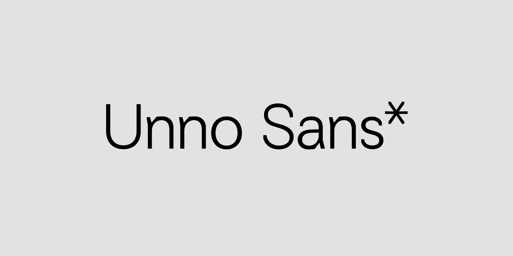
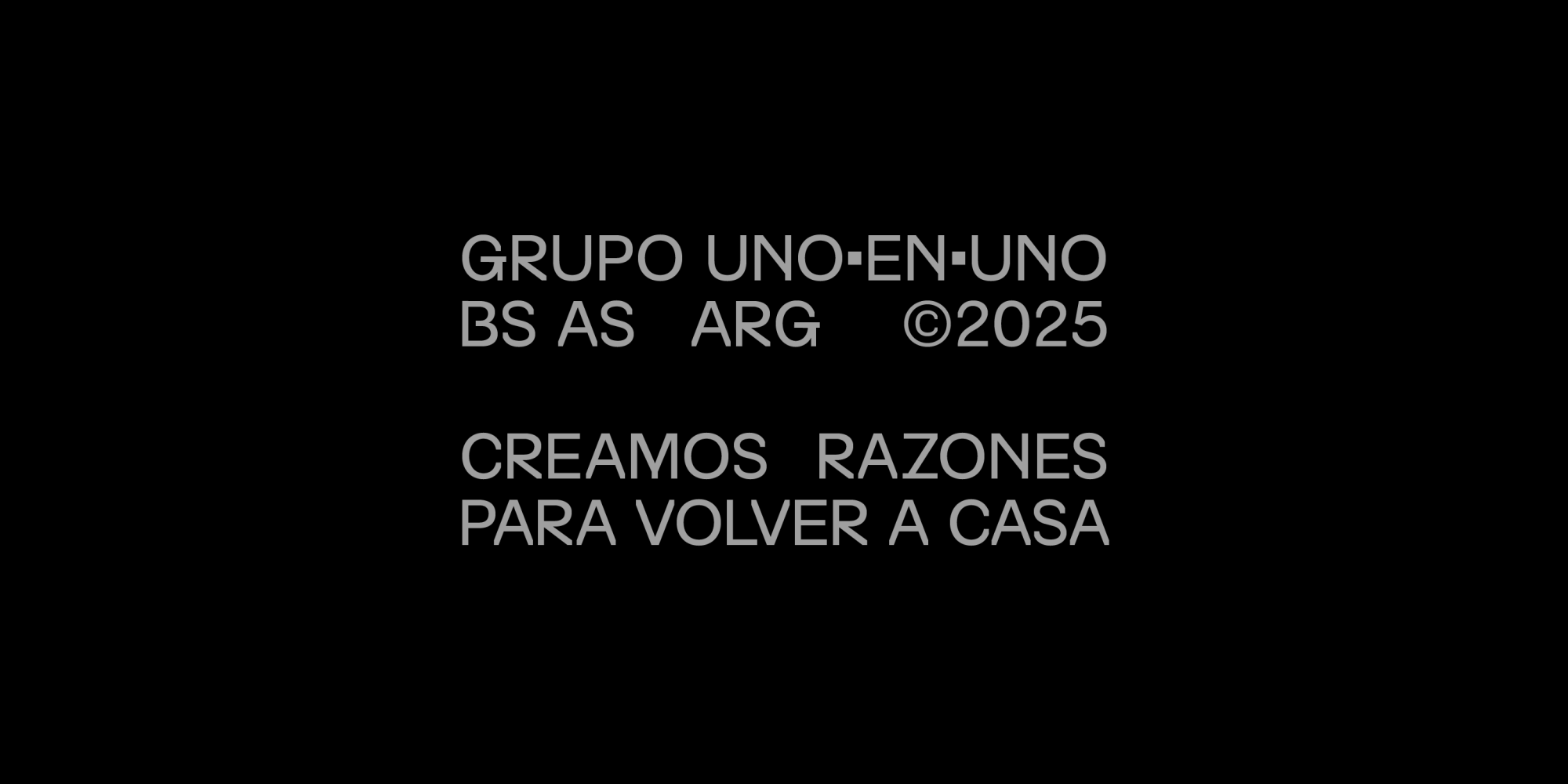
About Unno Sans
In collaboration with Ufficio, we worked closely with uno·en·uno to translate the studio’s architectural thinking into a new dimension: letterforms.
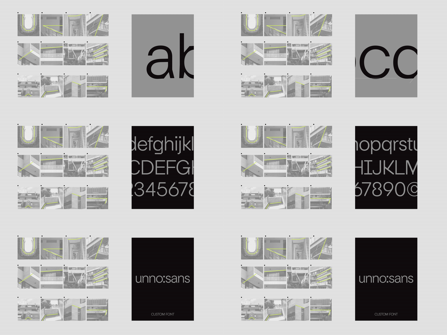
The Unno Sans typeface was designed by observing how space is conceived, inhabited, and scaled. How diagonals, proportions, materiality, and spatial relationships shape their projects.
Rather than treating typography as a neutral tool, the goal was to build a visual language that feels spatial: a typographic landscape with its own texture, rhythm, and presence.
Each letter echoes the studio’s approach to architecture: singular, human-scaled, and deeply connected to real life.
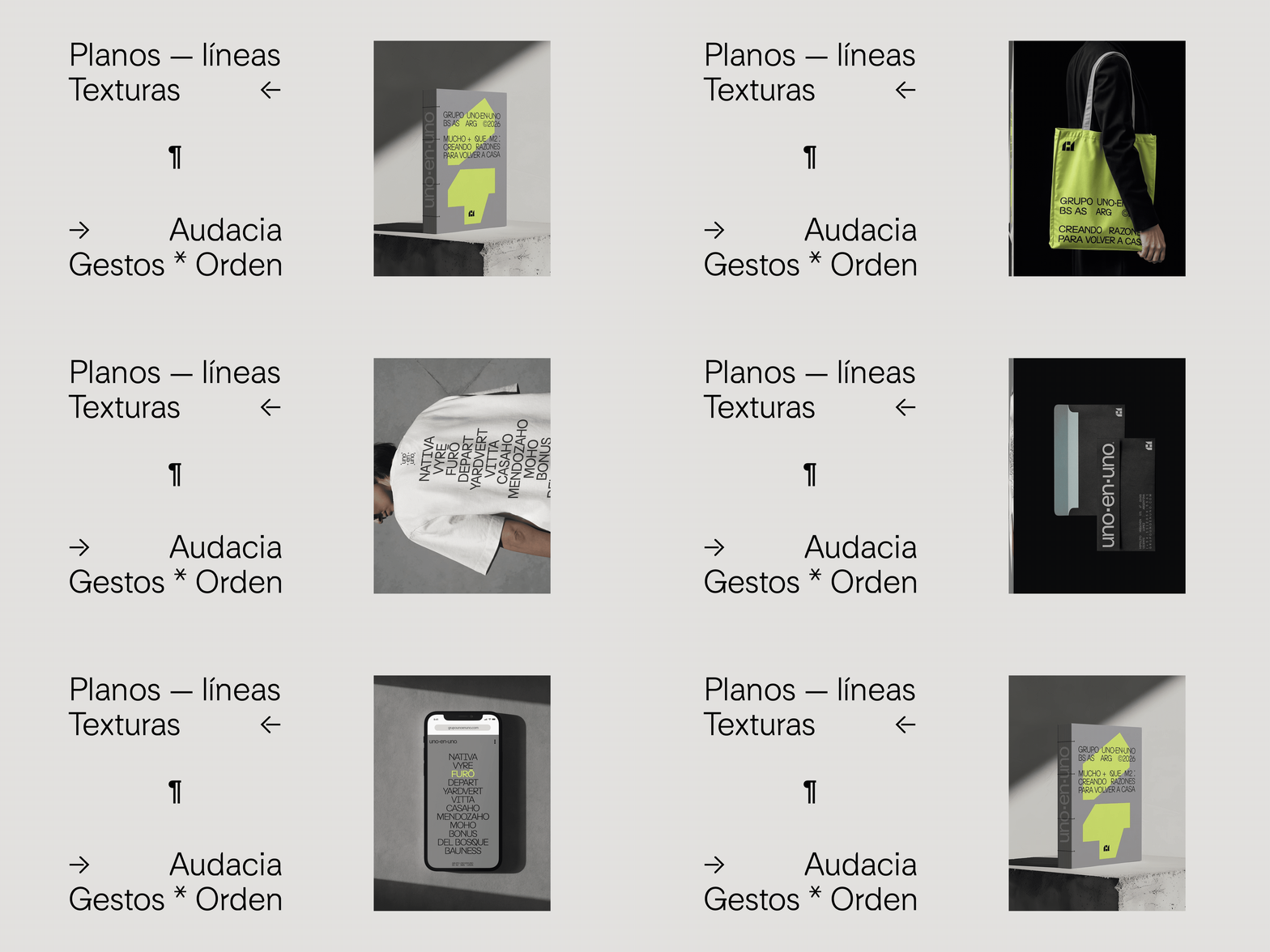
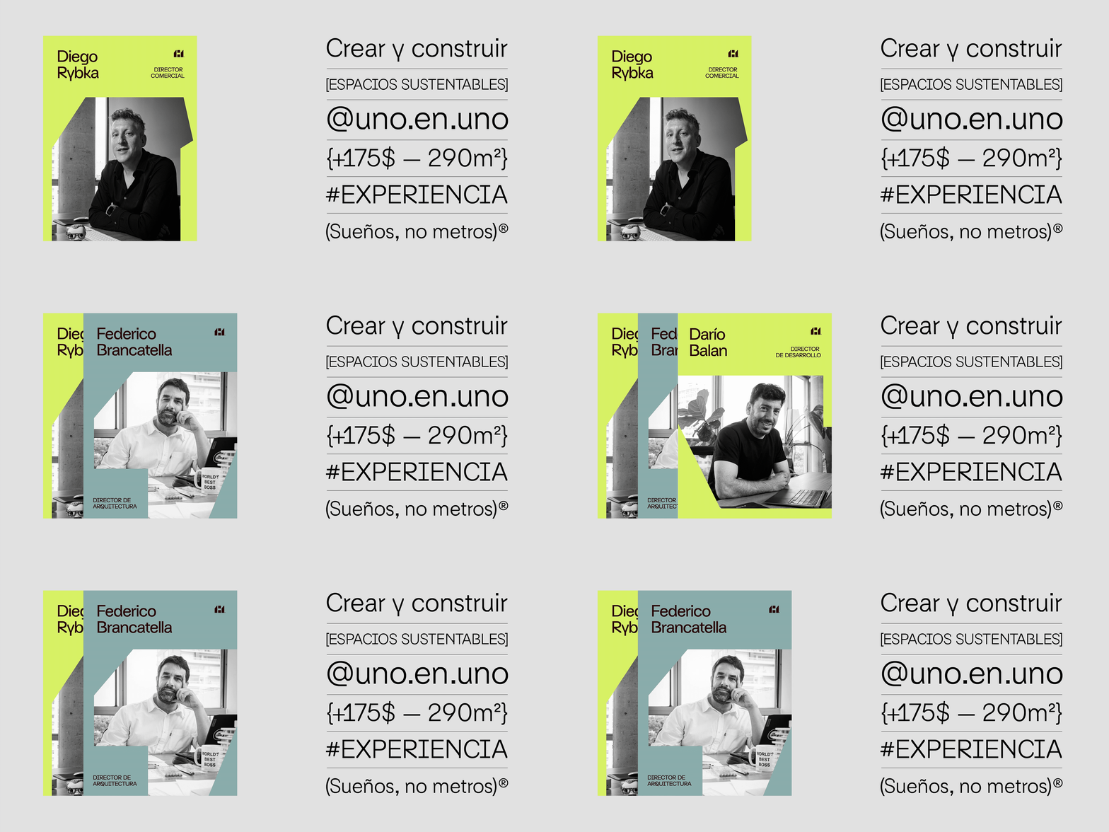
The result is a custom typeface that carries the voice of the brand across its communication system, reinforcing the idea that architecture, identity, and typography can be part of the same continuous thinking process.
- Art Direction
- Ufficio
- Client
- Uno En Uno
- Graphic Design
- Sofía Noceti, Crista Bernasconi, Luis Cruz, Denis Dallo
- Motion Graphics
- Juan Casal
- Project Management
- Luna Nuñez
- Year
- 2025
