
About Inge
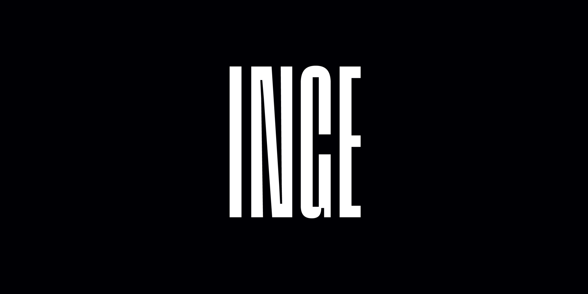
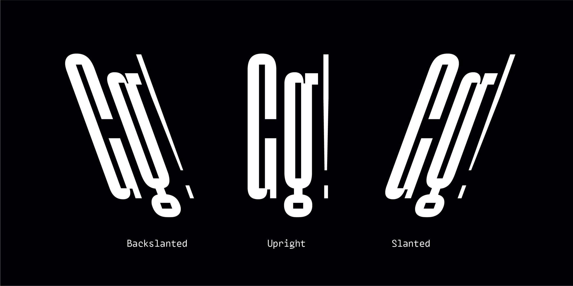
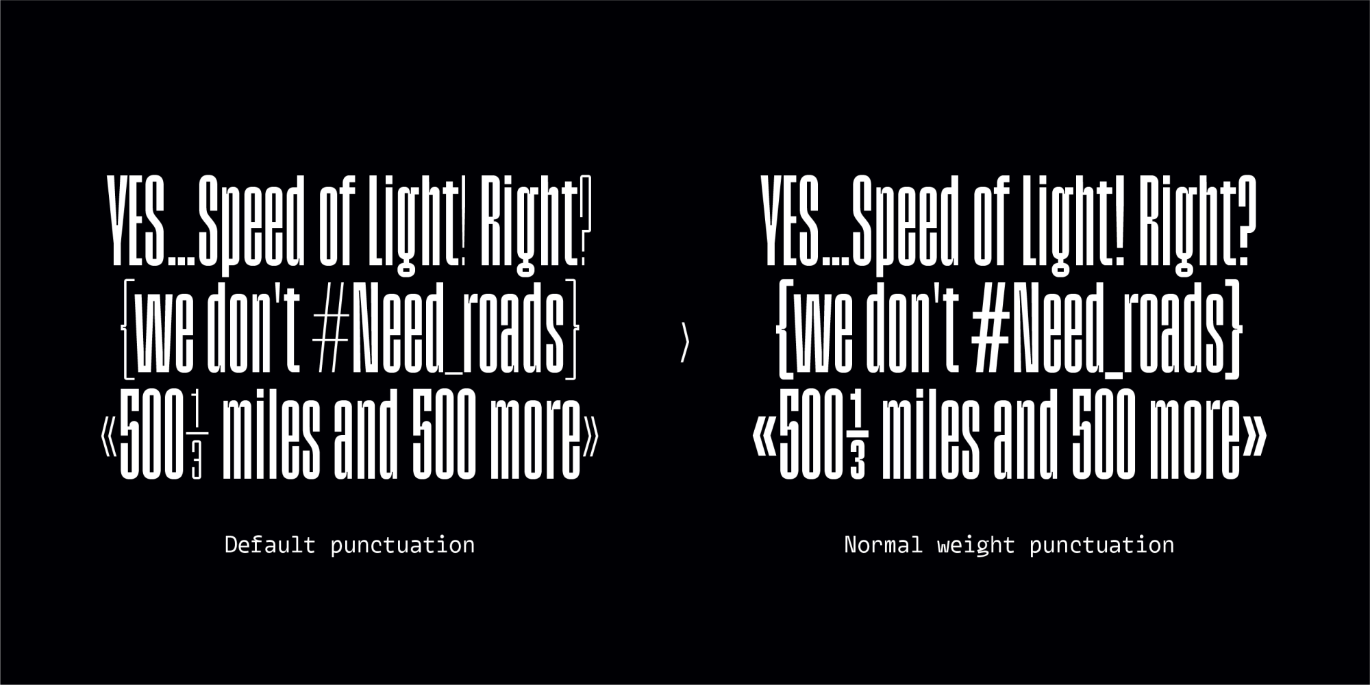
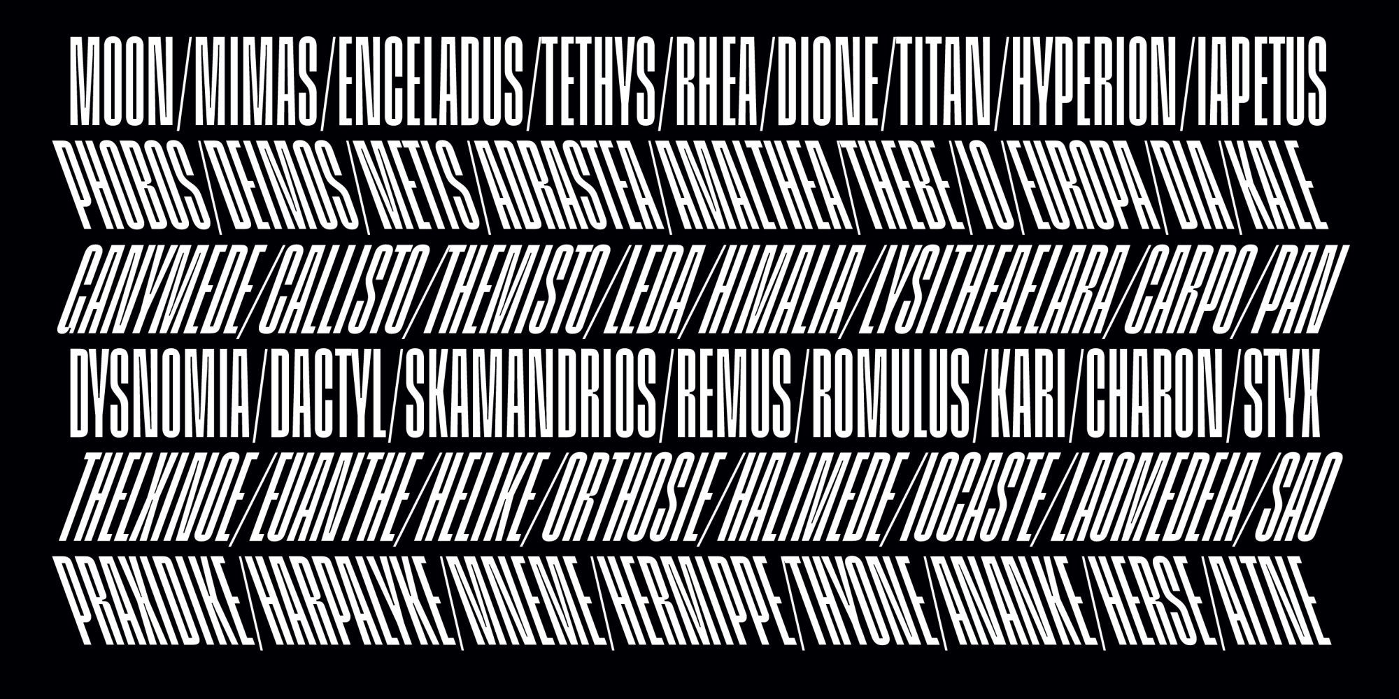
Inge is a tight display font with a strong sense of rhythm and a very solid texture. The narrow shapes on it make Inge very suitable to be used on large scales, creating robust solid text blocks. The side-to-side movement are a hint that something is accelerating, without losing strength and control.
It is a single weight typeface. But its perfect balance between acceleration and strenght gives Inge a unique and pure endurance.
Inge is named after Inge Lehmann, a Danish seismologist and geophysicist who discovered that the Earth has a solid inner core inside a molten outer core. She lived over 104 years.